Been meaning to write about this for a while. Tempus fugit. With the launch of Tableau 7, now seems to be a good time.
While we were doing research on our decision to become the nation’s largest private, not-for-profit university that is test-optional in freshman admission, I was doing some work studying patterns in ACT data. With the help of some folks in one of the nation’s largest schools of Computer Science I was able to machine extract ACT data from several years of administrations and create a small database of about 11 million records. I then began to visualize it.
I came up with several ways to look at it, but eventually wanted to see if there was a way to show two things at once: The relationship between ethnicity and test scores, and the relationship between income and test scores. For those of you who live on the east or west coast, here is an explanation of ACT scores. For this purpose, I’m only visualizing Composite Scores. If you still need more help, check out this concordance with SAT Scores.
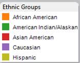
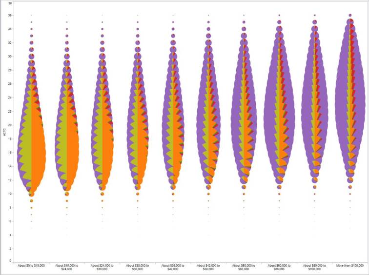
I created the y-axis as the ACT composite score, and then used self-reported income bands as the x-axis. Both are discrete, categorical values, even though ACT is numeric. ACT increases bottom-to-top, and income bands increase left-to-right. At the intersection of each variable is a pie chart, sized by the number of students in that group, and colored by ethnicity, using this legend:
I call the result a feather chart, for obvious reasons, and while it’s probably not very practical (and while lots of people hate pie charts for good reasons), it’s very instructive in this instance. We’re looking at overall trends of 11 million records: We don’t need to know in this instance that 25 ACT with $80K of income is slightly larger or smaller than 23 ACT with $100K of income.
On first glance, you can see a couple of things: The fattest part of the feather–the median test score–increases with income. The higher-income pies are more purple (that is, more Caucasian). And moving from left-to-right, you get the double-whammy of the relationship between income and ethnicity in the US.
It’s important to note here that being poor or being Hispanic, for instance, doesn’t cause you to score lower on the test (or at least this wouldn’t prove that hypothesis); rather this shows that there is a correlation between the two. Causality is best left to statisticians (who, of course, will only say that we cannot disprove that there is causality.) Close enough, I guess.
The lesson? Play around with your data, and try things you normally wouldn’t think of trying. You might get lucky, even if impractically so.


Hi Jon,
Nicely done! I find myself wanting to see one of the base pie charts however, to anchor myself against the relative size and positioning of each color. Perhaps you could provide a summary pie chart for each income category at the bottom…
LikeLike
Here is my response to Flowing Data: https://jonboeckenstedt.wordpress.com/2012/05/22/a-response-to-flowing-data-14/
LikeLike
Feather chart, cool.
Like any chart type the trick is recognizing when this type applies to your data.
I can visualize how parts of it are assembled, just can’t put all the pieces together. Could you do a “how to” article? Maybe with a downloadable file for this chart?
I read your followup article and agree, the feather is a more visually intuitive method of presenting the information. The other charts do allow viewers to extract some numbers from the charts if they are sitting at a desk and looking at the chart, but that is not the point of showing this slide and information during a presentation.
LikeLike
I’m not sure how you’d do it in other software, but this is just two discreet categories on each axis in Tableau. At the intersection is a pie chart that is sized by the number of records, with slices being ethnicity. Again, very limited us, but interesting, I think.
LikeLike